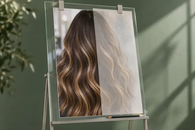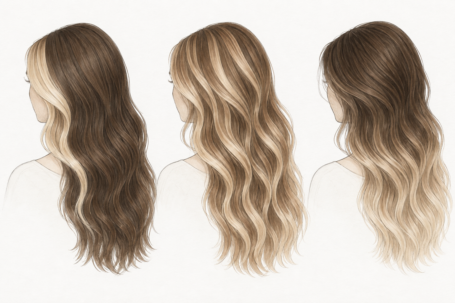

Two balayage wigs can use similar brown and blonde shades and still give a very different impression. The difference may be where the lighter hair sits: beside the face, across the surface, through the ends, or beneath a darker layer. For a custom order, choosing the colors is only part of choosing the result.
A useful color reference shows both the shades and their distribution. If you like the blonde in one photo but want a darker overall look, reducing the visible light sections may get closer to your intention than simply choosing a darker blonde.
Separate the shade from the amount of light hair
Shade describes the color you want to see. Placement describes where you want to see it. A cool beige face frame against a dark base can look quite different from the same beige spread through most of the lengths.
Before changing a color, identify what feels wrong in the reference. Is the blonde too golden? Is too much of it visible? Does it begin too close to the roots? Those are three different adjustments. Asking for “less blonde” leaves all three possibilities open.
For comparing warmer and cooler directions, see our ash blonde and honey blonde comparison. Once the tone is clear, assess its position separately.
Look at the face frame before the back
The front view is especially useful for checking how much brightness sits beside the face. Narrow light sections leave more of the darker base visible. A broader light section makes the lighter color more prominent at the front, even when much of the back remains dark.
Mark the area you mean on a front photograph. Include the parting you want to wear: a center-part reference does not show the same front arrangement as a side-part reference. If your customer plans to change the parting, include both intended views when checking the sample.
“Keep the front brighter, with more brown behind it” communicates a different result from “spread the blonde evenly throughout.” Neither is automatically better. The right choice depends on the look your customer wants.
Surface highlights and underneath color do different jobs
Color on the visible outer layer contributes to the first impression while the hair is down. Lighter sections underneath become easier to see when that layer moves or is lifted. A single front photograph can conceal this difference.
For a sample check, look at the hair resting naturally, then lift a small outer section to see what sits beneath it. A short movement video can show this more clearly than several nearly identical still photographs.
This matters when using a reference with curls. The turn of a curl brings different sections toward the camera. Do not judge the intended distribution from one bright curl alone; compare the front, side and back in the finished style.
Specify which areas should stay dark
Keeping darker roots with lighter ends produces a different layout from alternating dark and light sections through the lengths. A darker outer layer over lighter underneath sections is another choice. A general request for a mixture of dark and light hair does not distinguish between them.
Mark the areas where you want to keep the darker base. Then identify where the lighter color should begin and how much of it you want visible from the front, side and back.
NUSFACE can customize the balance to approximately equal amounts of dark and light color, or adjust it toward a darker or lighter result. Alongside that proportion, specify where each color should sit and how gradually the darker areas should transition into the lighter ones. Compare the sample from the front, side and back against your marked reference before confirming the design.
| What you want to change | What to mark on the reference |
|---|---|
| Less blonde around the face | The width and starting point of the front light sections |
| A darker overall appearance | The areas where more base color should remain visible |
| Brighter ends without a much lighter top | Where the transition begins and how far brightness extends through the lengths |
| Light sections visible mainly in movement | The underneath sections and the hair resting above them |
These are ways to describe a design. They are not a substitute for reviewing how the proposed color works on the specific wig.
Check the transition as well as the endpoints
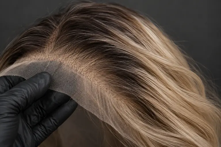
A dark root and a blonde end do not explain what happens between them. The transition may be gradual, start at different heights across the hair, or have a more distinct boundary. That middle area can decide whether the result matches the reference you selected.
Compare the transition on both sides and at the back. Look for the intended pattern rather than demanding that every strand change color at exactly the same point. If you want a particular root effect, our root melt and shadow root article explains those choices separately.
Turn a favorite photo into a usable color decision
Choose one main reference. Then identify what must stay and what you want to change. For example: keep the beige blonde tone, narrow the face frame, retain more brown on the surface, and preserve the lighter ends.
If several photos are needed, label the role of each: one for tone, one for the front, another for the back. Otherwise, a set of attractive images may describe incompatible results. Our reference-photo brief shows how to organize that information.
NUSFACE’s displayed styles are starting references for custom work. Color placement, lace, size and styling requirements can be discussed together through our custom service. Review the proposed result as a whole: a color you like, placed where you actually want to see it.